
Projects
A selection of professional and academic projects in applied machine learning, generative AI, and data systems.
I Help decision makers
What I Do
I work at the intersection of applied ML, generative AI, and decision-making: building models and systems that are evaluated rigorously. I help teams define meaningful metrics, reconcile and explore data, and translate insights into decisions.
1. Applied ML & Generative AI
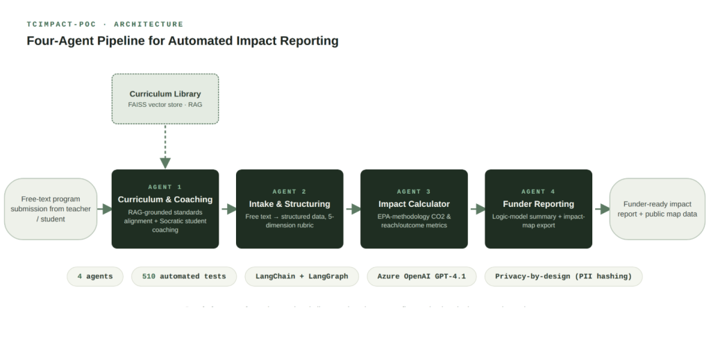
A four-agent LLM system (LangChain, LangGraph, Azure OpenAI GPT-4.1, RAG via FAISS) that turns free-text program submissions into funder-ready impact reports for an international climate-education nonprofit operating in 50+ countries, replacing a year-end form nobody filled out on time.
Problem
The organization’s only outcome-data mechanism was a single year-end form. Teachers were overwhelmed, submissions arrived late or incomplete, and the org had no formalized measurement framework capable of producing the evidence-tier data major funders require.
Approach
Designed four agents, each owning one stage: curriculum-aligned coaching with RAG over the program’s own curriculum library, intake and structuring of messy free text into a 5-dimension impact rubric, outcome calculation (EPA-methodology CO2 math for carbon-focused projects, reach/behavior-change metrics for the rest), and funder-facing reporting mapped to an EPA logic model. Built a privacy-by-design pipeline with PII hashing and automated redaction throughout. Validated the system with 510 automated tests, plus a separate evaluation harness scoring the LLM extraction step against a hand-labeled gold set with precision, recall, F1, and a Wilson score confidence interval, including a self-consistency check across repeated calls.
Insight
Running that evaluation harness against the deterministic fallback path surfaced two real bugs that looked fine on a handful of manual checks: a name-capture regex that over-matched to the next comma, and a keyword list that didn’t actually include the word “NGO.” Fixing both moved precision from 0 to 0.5 and recall from 0 to 0.3 on the gold set: an honest, incremental number, not a victory lap, but a concrete demonstration of why LLM output needs measurement, not a glance.
Impact
Demoed to leadership as a working proof of concept; production deployment is planned on the organization’s own Azure tenant. The system is designed to replace an unreliable annual form with continuous, structured, funder-ready reporting collected passively as teachers and students actually use the tool.
LangChain · LangGraph · Azure OpenAI (GPT-4.1, text-embedding-3-large) · FAISS · Streamlit · SQLite · pytest
2. Applied ML & Computer Vision
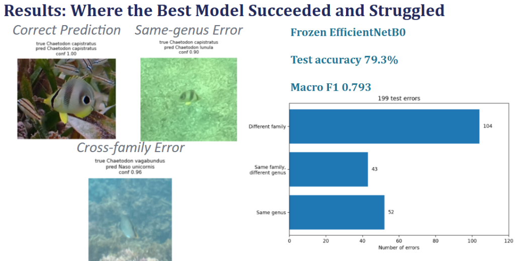
A fine-grained image classifier for 16 tropical reef fish species, built on ~5,600 real citizen-science observations, extended with spatiotemporal metadata fusion and a redesigned augmentation policy.
Problem
Citizen-science platforms like iNaturalist collect wildlife imagery at a scale no expert can review manually. Reef fish are a hard fine-grained classification case: underwater images vary wildly in lighting, visibility, and pose, while closely related species look nearly identical.
Approach
Compared transfer-learning strategies (ResNet50 from random init through staged fine-tuning, and a frozen EfficientNetB0 backbone) on a fixed 250/40/60 per-species train/validation/test split. Extended the strongest image-only model with a metadata branch fusing latitude, longitude, and observation date, using sinusoidal encoding for the two cyclical variables (longitude, day-of-year) so their geometry is represented correctly. Redesigned a failed class-targeted augmentation policy into a symmetric, underwater-motivated one (color-cast variation, blur, occlusion) applied evenly across classes. Evaluated every comparison with exact McNemar tests and species-stratified paired bootstrap confidence intervals rather than single-run accuracy.
Insight
Fusing image features with geography and season lifted test accuracy from 78.33% to 89.48% (macro F1 +0.1098, 95% CI [+0.087, +0.132], McNemar p < 0.0001), the largest gain in the project. Two earlier assumptions didn’t hold up: explicitly modeling family-to-species taxonomy produced no real improvement over flat classification (Δ macro F1 −0.0016, McNemar p = 1.0), and the first augmentation attempt, applied only to data-scarce classes, made those classes’ performance worse, not better. That failure directly motivated the symmetric redesign, which recovered +0.1132 macro F1 on the affected species.
Impact
Demonstrates the full arc of a real ML investigation: a failed approach diagnosed and fixed, a negative result reported instead of buried, and a validated multimodal architecture that meaningfully outperforms an image-only baseline.
Python · TensorFlow/Keras · EfficientNetB0 · tf.data · SciPy (McNemar, paired bootstrap) · scikit-learn
3. Unsupervised ML & Equity Analytics
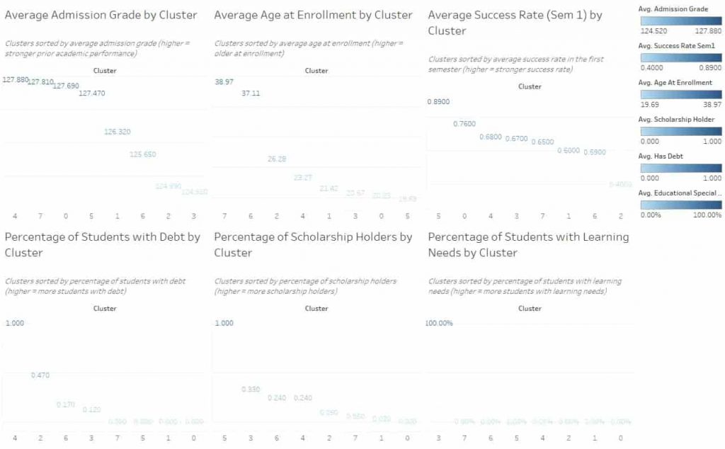
K-Means clustering and a fairness audit revealed that financial burden, not academic preparation, is the primary driver of dropout risk, pointing to where targeted interventions will have the most impact.
Problem
Educational institutions often have aggregate outcome data (graduation rates, GPA distributions), but lack visibility into the distinct pathways students take to reach those outcomes. Without segmentation, it’s impossible to identify at-risk groups early enough to intervene, or to design supports that target the right students.
Approach
Applied K-Means clustering (k=8, selected via elbow method, Davies-Bouldin index, and interpretability triangulation) to a 4,424-student higher education dataset with 36 variables spanning academic performance, demographics, and financial indicators. Used UMAP for 2D cluster visualization and ran chi-square fairness audits on sensitive attributes (gender and age) to identify demographic skews before recommending any intervention.
Insight
Financial burden and age, not academic preparedness, are the strongest differentiators between student success and dropout. Scholarship support emerged as the clearest protective factor across all clusters.
For example, cluster 1 had a 40% dropout risk and comprised older learners carrying debt. In contrast, cluster 4 had a 89% success rate and encompassed younger students with scholarships.
Impact
Delivered 8 cluster profiles and a Tableau dashboard designed for non-technical stakeholders, translating ML outputs into actionable intervention recommendations. The fairness audit framework demonstrates how to surface demographic skews before deploying any support program, reducing the risk of interventions that help some groups while inadvertently overlooking others.
Python · scikit-learn · K-Means · UMAP · Tableau · Chi-Square Testing · Equity Analysis · Jupyter
4. Computer vision & OCR
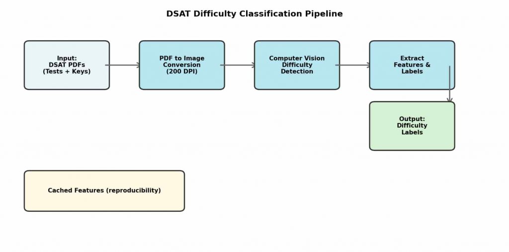
An end-to-end computer vision pipeline that classifies Digital SAT questions by difficulty at 98–99% accuracy, making consistent, scalable instructional planning possible without touching question text.
Problem
Test prep instructors manually categorized hundreds of Digital SAT questions by difficulty for every practice test; a slow, inconsistent process that bottlenecked curriculum planning and introduced rater bias. With 6 official practice papers and ~90 pages each, this was unsustainable at scale.
Approach
Built an end-to-end pipeline processing 588 question pages extracted from official College Board practice tests. The system converts PDF answer keys to high-resolution grayscale images, isolates the difficulty marker region using calibrated coordinates, and applies binary thresholding with contour detection to count filled circles, mapping 3+ circles to Hard, 2 to Medium, 1 to Easy.
No text parsing, no NLP. The entire classification relies on visual structure.
Insight
The College Board encodes difficulty as a visual pattern, filled circle count, in its answer keys. Once the right image region is isolated, this signal can be extracted programmatically with high reliability across all official test formats, making the approach robust and reusable.
Impact
The pipeline processed ~540 questions across 6 practice tests, achieving 98–99% classification accuracy. Manual labeling time dropped from approximately 2 hours to under 5 minutes per test. The project also demonstrates IP-compliant data science: the repo ships with cached derived features rather than copyrighted source materials, making it fully shareable and reproducible.
Python · OpenCV · OCR · pdf2image · Computer Vision · Jupyter · Reproducible Pipelines
5. Dashboard Design
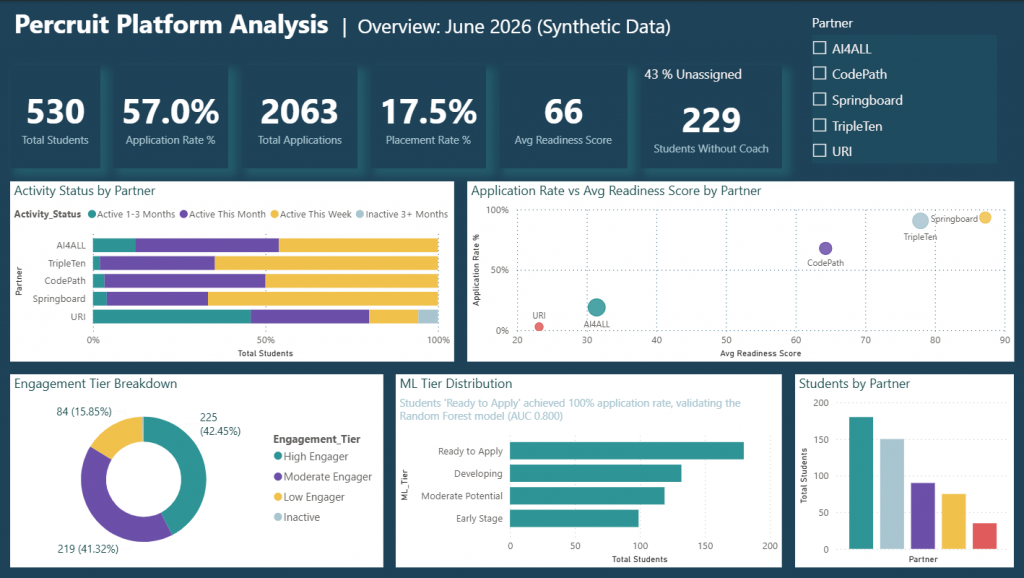
A two-page Power BI report giving an early-stage platform’s leadership a single view of student engagement, predictive readiness scoring, and application-to-hire funnel performance, built on synthetic data modeling the platform’s real structure.
Problem
An early-stage recruiting/placement platform needed leadership to see, in one place, how students moved from onboarding through application, interview, and placement, and which partners and engagement segments were driving or dragging on that pipeline.
Approach
Built a two-page Power BI report on a data model reflecting the platform’s structure (students, partners, application/interview/placement events), using synthetic data to protect privacy. The Overview page defines and tracks core KPIs: Total Students, Application Rate %, Placement Rate %, Avg Readiness Score, Students Without Coach, segmented by engagement tier and partner. The Funnel page tracks the pipeline stage by stage (Students Applied → Interviewed → Hired), including Avg Days to Hire and how a predictive readiness score compares to students’ actual apply behavior.
Insight
Splitting the report into two pages, rather than one dense dashboard, separates two different questions: “who are our students and how engaged are they” versus “how many convert to a hire, and where do they drop off.” Putting both on one page would force a reader to context-switch between a segmentation question and a conversion question.
Impact
With real data, the dashboard made it clear that student hires were not being reliably tracked, because the platforms existing reporting step depended on students self-reporting when they were hired. Once that gap was visible, leadership evaluated alternative tracking methods. (This portfolio version uses synthetic data for privacy).
Power BI · DAX · Data Modeling · KPI Design
6. Data Engineering
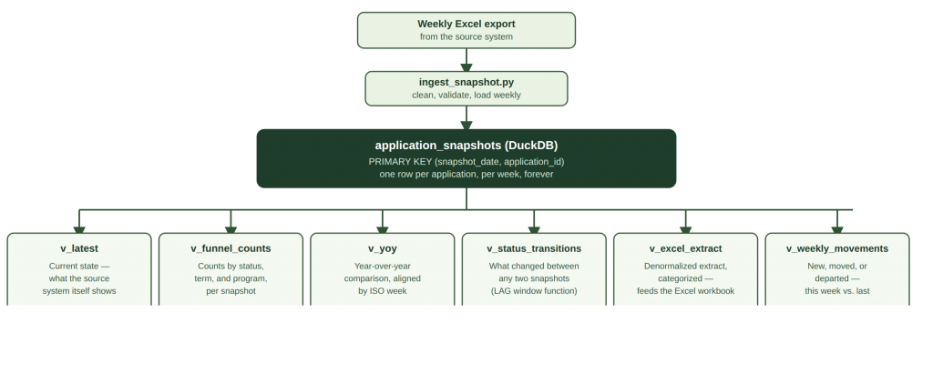
A DuckDB and Python pipeline that captures full weekly snapshots of an operational system that only ever shows the present, enabling week-over-week and year-over-year institutional reporting the source system can’t provide on its own.
Problem
A study abroad office’s system of record shows only what’s true right now: when an application’s status changes, the previous state is gone. That makes several genuinely important questions unanswerable: how this year’s cycle compares to last year’s at the same point, and where applications are getting stuck and for how long.
Approach
Built a DuckDB database that captures a full copy of every application every week, tagged with that week’s date, so the database accumulates permanent history instead of overwriting the present state. Six SQL views sit on top of that table: a current-state view matching what the source system itself shows, funnel and year-over-year aggregation views, a window-function query reconstructing status transitions between any two snapshots, and an anti-join query classifying every application as new, moved, or departed week over week. (This portfolio version uses synthetic data for privacy).
Insight
Every architecture choice reflects a constraint. For example, DuckDB, not a database server, because the data volume and single writer access pattern do not justify one. Weekly full snapshots, not real time syncing, because the source system exposes no hooks for it and weekly matches the office’s reporting cadence. Program categorization derived in a SQL view rather than stamped onto each row at load time, so the rules can be corrected retroactively without reprocessing history. And the output is a refreshed Excel workbook because the end user’s fluency is Excel.
Impact
The pipeline reliably distinguishes new, persisting, and departed applications between any two weekly snapshots, including catching abandoned draft applications, a signal that’s easy to miss without a snapshot history. It makes questions like “what changed this week” and “how does this cycle compare to last year” answerable.
DuckDB · Python · pandas · SQL (window functions, views) · openpyxl
7. Institutional Reporting
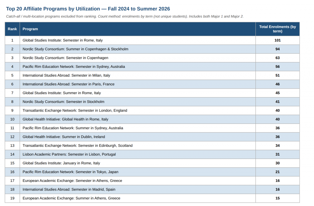
Ranks affiliate study-abroad programs broken down by student major, to inform which partnerships are worth prioritizing for institutional investment. (This portfolio version uses synthetic data for privacy).
Problem
An office running dozens of affiliate (third-party-provider) study abroad programs has no ranked view of which ones are driving enrollment, or which academic majors gravitate toward which programs, information needed to decide where to invest, such as developing an institution-led version of a popular affiliate program.
Approach
Filtered 1,017 synthetic enrollment records (the portfolio version uses synthetic data for privacy) across 8 terms to affiliate programs only, excluding catch-all and multi-location labels that aren’t actionable as a single program. Ranked the remaining programs by total enrollment and took the top 20. Stacked each enrollment’s primary and secondary major into one column so double majors count toward both patterns, then built a program-by-major pivot and flagged majors where 40%+ of enrollment concentrates in a single program.
Insight
A ranked list alone tells the team what’s popular; the concentration analysis tells the team where a program has become a single point of dependency for a specific major: a distinct strategic signal that argues for either deepening a valuable partnership or diversifying a risky one. This same approach, applied to real institutional data, has directly informed real investment conversations: a director used analysis like this to advise a Vice Provost on program strategy.
Impact
Produces a 4-sheet, presentation-ready Excel workbook: ranked programs, a programs-by-majors matrix, concentration patterns, and full source-data traceability, that a director can open and act on without touching a notebook or running code. The goal throughout: better program-investment decisions that ultimately support students.
Python · pandas · openpyxl · Excel
8. SQL & Database Design
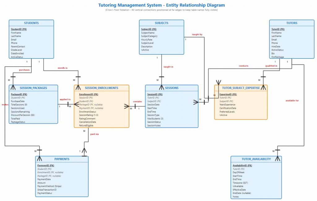
A 9-table normalized MySQL schema, covering students, tutors, sessions, packages, and payments, that answers three critical business questions in real time: what generates revenue, who is available, and which packages are going unused.
Problem
A tutoring business managing group sessions, prepaid packages, multi-subject tutors, and Stripe payments cannot scale on spreadsheets. Without a reliable data model, three questions that directly affect revenue go unanswered: which subjects generate the most income, which tutors are available and qualified for a specific student request, and which prepaid packages are expiring with sessions still unused.
Approach
Designed a fully normalized (3NF) relational schema in MySQL 8.0 with 9 interconnected tables: Students, Tutors, Subjects, Sessions, Session_Packages, Payments, Session_Enrollments, Tutor_Subject_Expertise, and Tutor_Availability. Applied Crow’s Foot ER modeling, composite indexing, and business-rule constraints, including group session size limits, a 24-hour cancellation policy, Stripe transaction ID tracking, and a generated column for package session credits that eliminates update anomalies.
Three analytical queries were written to directly answer three business questions.
Insight
Math/Science sessions generated 52% of total revenue. A single 5-table JOIN identifies the specific tutor(s) qualified, rated highly, and available. Sorting active packages by sessions remaining identifies exactly which students need a renewal reminder.
Impact
Delivered an analytics-ready schema with enforced business rules that makes reliable operational reporting possible. This project demonstrates the ability to design the data infrastructure that makes dashboards and models trustworthy in the first place.
SQL · MySQL 8.0 · Database Design · ER Modeling · 3NF Normalization · Analytical Queries
 English (United States)
  English (UK)